Technical Analysis
A practical guide to reading charts, identifying trends, and using technical indicators to forecast market movements and develop trading strategies. Ideal for traders seeking to enhance decision-making and manage risk effectively.
Understanding the Pi Cycle Top Prediction Indicator
The Pi Cycle Top Prediction indicator enhances its predecessor by projecting future crossover points of two key moving averages:
- 111-day Moving Average (111DMA)
- 350-day Moving Average multiplied by two (350DMA x2)
The indicator uses the rate of change of these moving averages over the past 14 days to extrapolate when they might cross, signalling a potential market top. Historically, such crossovers have accurately identified Bitcoin’s cycle tops, with previous predictions being within three days of actual peaks.
Implications for Market Behaviour
When the 111DMA nears the 350DMA x2, it indicates unsustainable price growth, often driven by speculation. A crossover typically signals the end of a bull market, leading to a price correction or bear market. This tool is crucial for professional investors as a risk management measure, helping them assess and adjust their market exposure during overheating periods.
Key Prediction: September 17, 2025
The indicator currently predicts a crossover on September 17, 2025, signalling a potential market top. Investors can track this projection on the Bitcoin Magazine Pro platform.
Origins and Related Tools
The tool was developed by Matt Crosby, Lead Analyst at Bitcoin Magazine Pro, building on the original Pi Cycle Top indicator by Philip Swift, which has a strong record of identifying market peaks. Related tools include:
- The Original Pi Cycle Top Indicator
- The Pi Cycle Top and Bottom Indicator
A detailed video explainer by Matt Crosby is available for further insights.
Importance for Professional Investors
In a volatile market like Bitcoin, the Pi Cycle Top Prediction chart offers:
- Data-driven insights for better portfolio management
- Precise timing to estimate cycle tops accurately
- Risk mitigation through early warning of market overheating
As institutional adoption grows, such predictive tools become essential for navigating Bitcoin’s unique market cycles, improving long-term investment outcomes.
Source: Bitcoin Magazine - Pi Cycle Top Prediction
Candlestick Charts
Candlestick charts are a popular tool used in financial markets to represent price movements of assets such as stocks, commodities, currencies, and indices over a specific time period. Originating from Japanese rice trading in the 18th century, candlestick charts provide more information than traditional line charts by displaying the open, high, low, and close prices within a given timeframe. This rich information allows traders and investors to make more informed decisions based on price action and potential market sentiment.
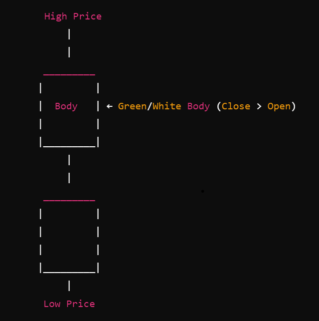
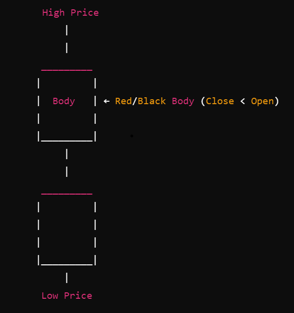
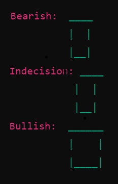
Components of a Candlestick
Each candlestick consists of two main parts:
-
Body: Represents the range between the opening and closing prices.
- Bullish Candle: Typically coloured green or white, indicating that the closing price is higher than the opening price.
- Bearish Candle: Typically coloured red or black, indicating that the closing price is lower than the opening price.
-
Wicks (Shadows): The thin lines above and below the body represent the highest and lowest prices during the time period.
- Upper Wick: Extends from the top of the body to the highest price.
- Lower Wick: Extends from the bottom of the body to the lowest price.
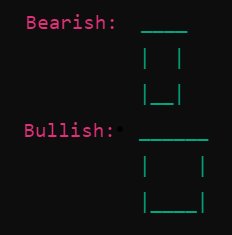
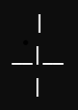
Basic Structure of a Bullish Candlestick
Basic Structure of a Bearish Candlestick
- Time Frame: Each candlestick represents a specific time frame (e.g., 1 minute, 5 minutes, 1 day).
- Price Action: The combination of the body and wicks provides insights into the market sentiment during the time frame.
- Long Body: Indicates strong buying or selling pressure.
- Short Body: Suggests indecision in the market.
- Long Wicks: Show that prices moved significantly during the time frame but were pulled back before the period ended.
Common Candlestick Patterns
Understanding candlestick patterns can help predict future price movements based on historical patterns. Below are some of the most common patterns categorized into bullish (indicating potential upward movement) and bearish (indicating potential downward movement) signals.
Bullish Patterns
-
Hammer
- Description: A single candlestick with a small body near the top, a long lower wick, and little to no upper wick.
- Implication: Indicates potential reversal from a downtrend to an uptrend.
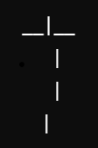
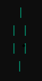
- Visual Representation:

-
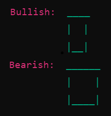
Bullish Engulfing
- Description: Comprises two candles. The first is a small bearish candle, followed by a larger bullish candle that completely engulfs the previous candle's body.
- Implication: Suggests a strong reversal from bearish to bullish sentiment.
- Visual Representation:

-
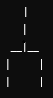
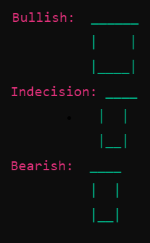
Morning Star
- Description: A three-candle pattern: a long bearish candle, a short-bodied candle (indecision), and a long bullish candle.
- Implication: Indicates a potential reversal from a downtrend to an uptrend.
- Visual Representation:

Bearish Patterns
-
Shooting Star
- Description: A single candlestick with a small body near the bottom, a long upper wick, and little to no lower wick.
- Implication: Signals potential reversal from an uptrend to a downtrend.
- Visual Representation:

-
Bearish Engulfing
- Description: Consists of two candles. The first is a small bullish candle, followed by a larger bearish candle that completely engulfs the previous candle's body.
- Implication: Suggests a strong reversal from bullish to bearish sentiment.
- Visual Representation:

-
Evening Star
- Description: A three-candle pattern: a long bullish candle, a short-bodied candle (indecision), and a long bearish candle.
- Implication: Indicates a potential reversal from an uptrend to a downtrend.
- Visual Representation:

Neutral Patterns
-
Doji
- Description: A single candlestick where the opening and closing prices are virtually the same, resulting in a very small body with wicks on both sides.
- Implication: Indicates market indecision; potential reversal or continuation depending on preceding candles.
- Visual Representation:

-
Spinning Top
- Description: Similar to the Doji but with a slightly larger body. It has long wicks on both sides and indicates indecision.
- Implication: Suggests that neither buyers nor sellers have full control, potentially leading to a reversal or continuation.
- Visual Representation:

Using Candlestick Patterns in Trading
Candlestick patterns are most effective when used in conjunction with other technical analysis tools such as trend lines, support and resistance levels, and indicators like Moving Averages or Relative Strength Index (RSI). Here are some tips for using candlestick patterns effectively:
- Confirm with Volume: Higher trading volume during the formation of a pattern can validate its strength.
- Context Matters: Patterns formed at key support or resistance levels tend to be more reliable.
- Combine with Trend Analysis: Identify the prevailing trend to determine whether a pattern suggests continuation or reversal.
- Use Multiple Time Frames: Analysing patterns across different time frames can provide a more comprehensive view of potential market movements.
Conclusion
Candlestick charts are a versatile and informative tool for analysing market behaviour. By understanding the basic structure of a candlestick—including the body and wicks—and the various candlestick patterns and their implications, traders can gain valuable insights into market dynamics such as bullish or bearish trends, reversals, and continuations. This comprehensive knowledge enables more informed trading decisions and the identification of potential price movements. However, while candlestick patterns can provide valuable signals, it is essential to use them in conjunction with other analysis methods and risk management strategies to enhance their effectiveness.